The hands who made
“the made by hand”.
CHICORY Organic Market
Chicory was born as a project of the ACOB family, recovering a conscious connection with our foods through an organic Market, reflecting on the origin of the food, its sovereignty and eating well. As a family business they ran a bakery, a cafeteria and now they contact us to develop an identity for their market that can unify the local farmers, community and the responsible production and consumption of food.
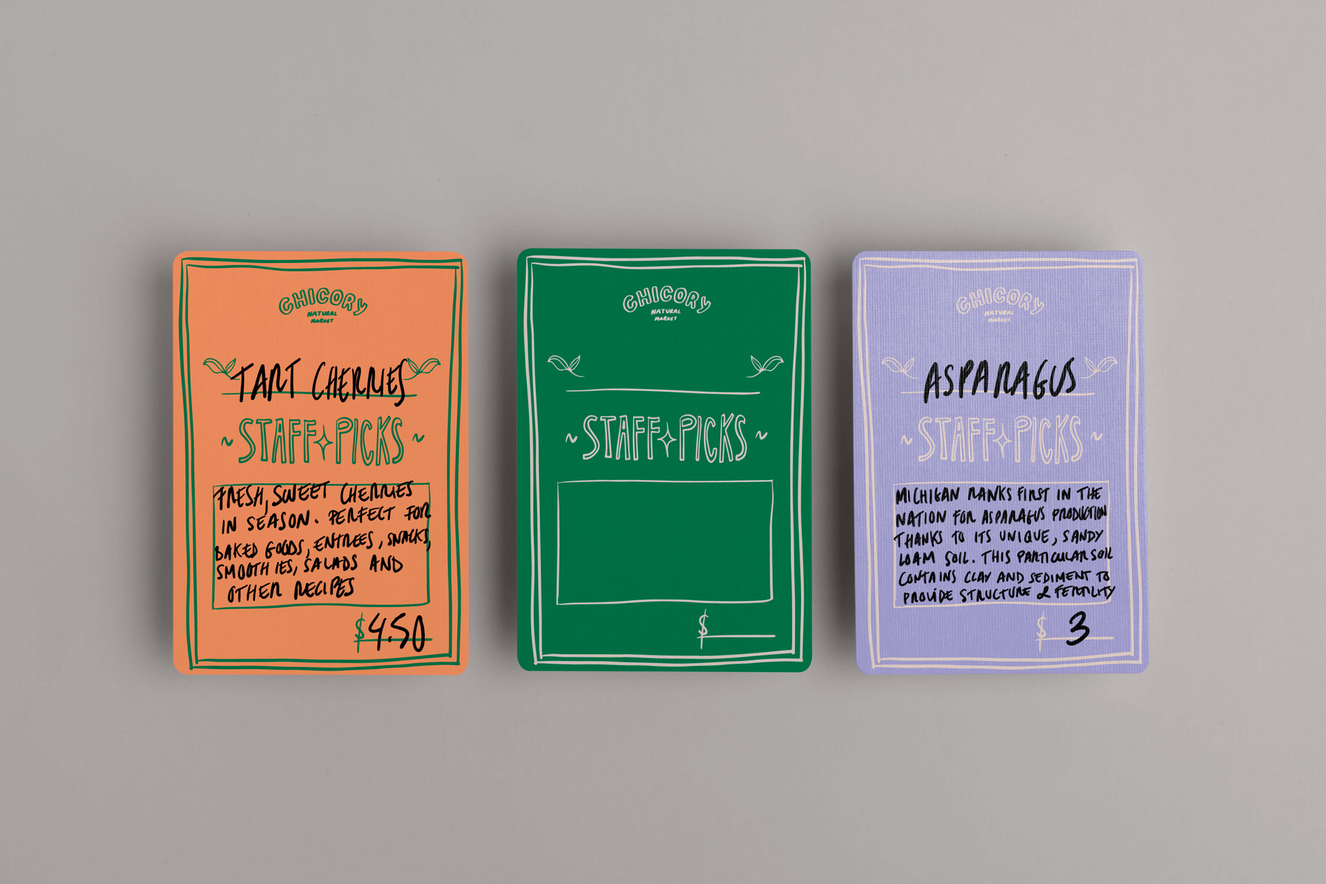
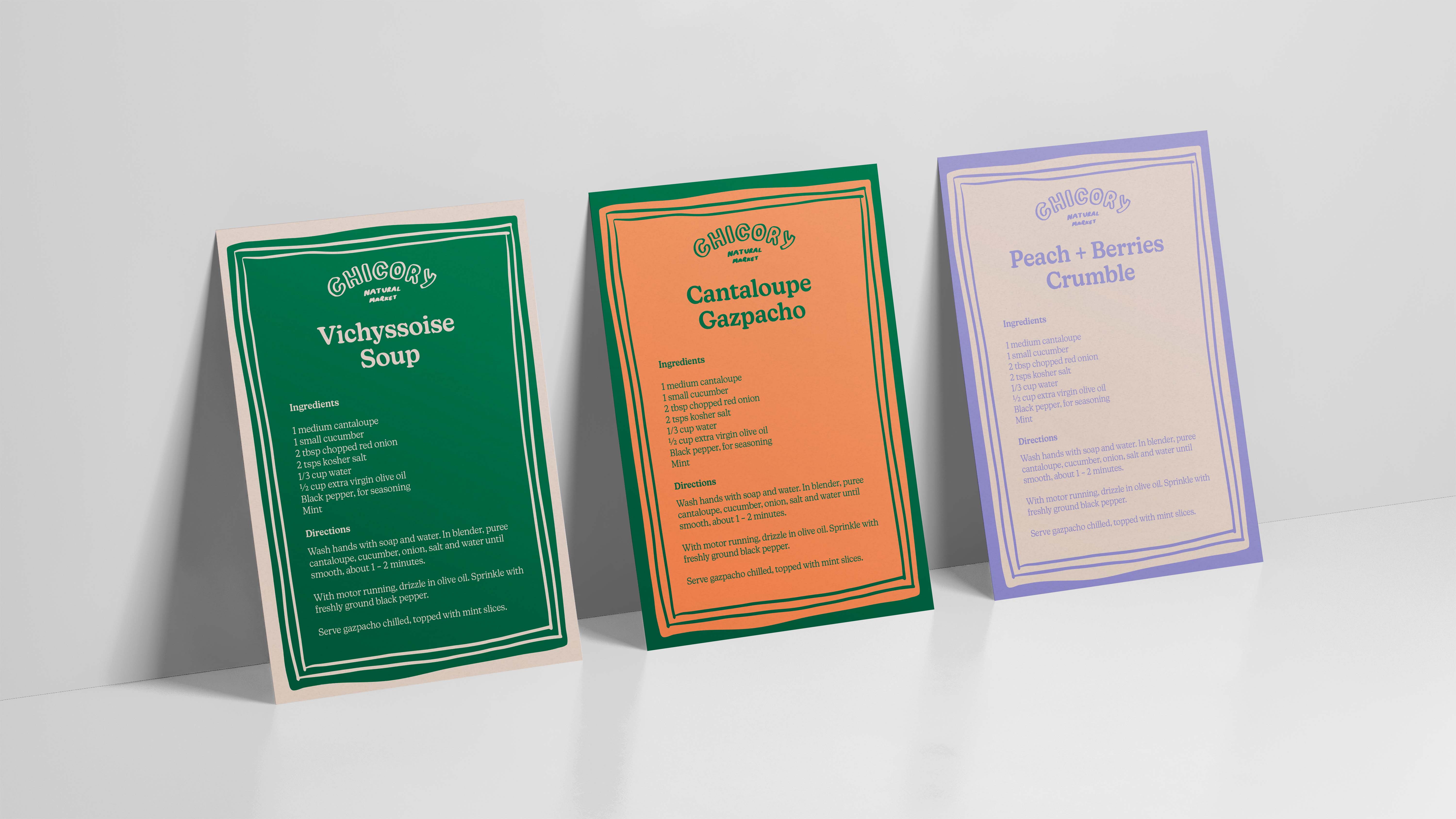
For the development of graphic elements we based our work on the hands of all those who make possible that food reach our table, the farmers, collectors, those who pack and cook, so before starting the project we visited the farms and collected the handwriting of all the people involved in this process.
For the development of graphic elements we based our work on the hands of all those who make possible that food reach our table, the farmers, collectors, those who pack and cook, so before starting the project we visited the farms and collected the handwriting of all the people involved in this process.
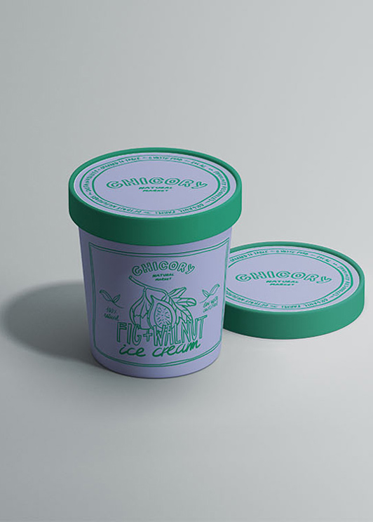
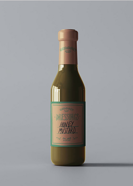
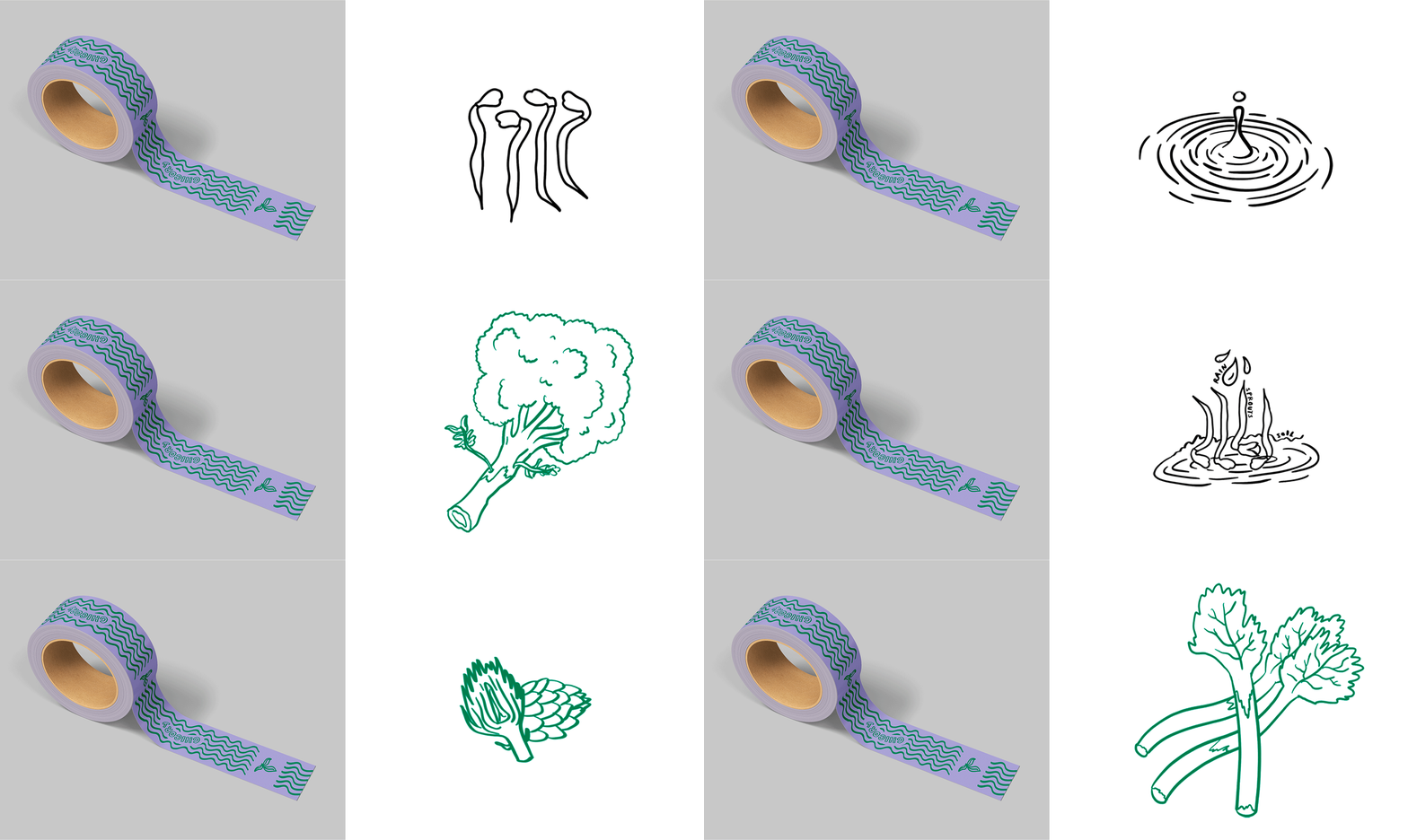
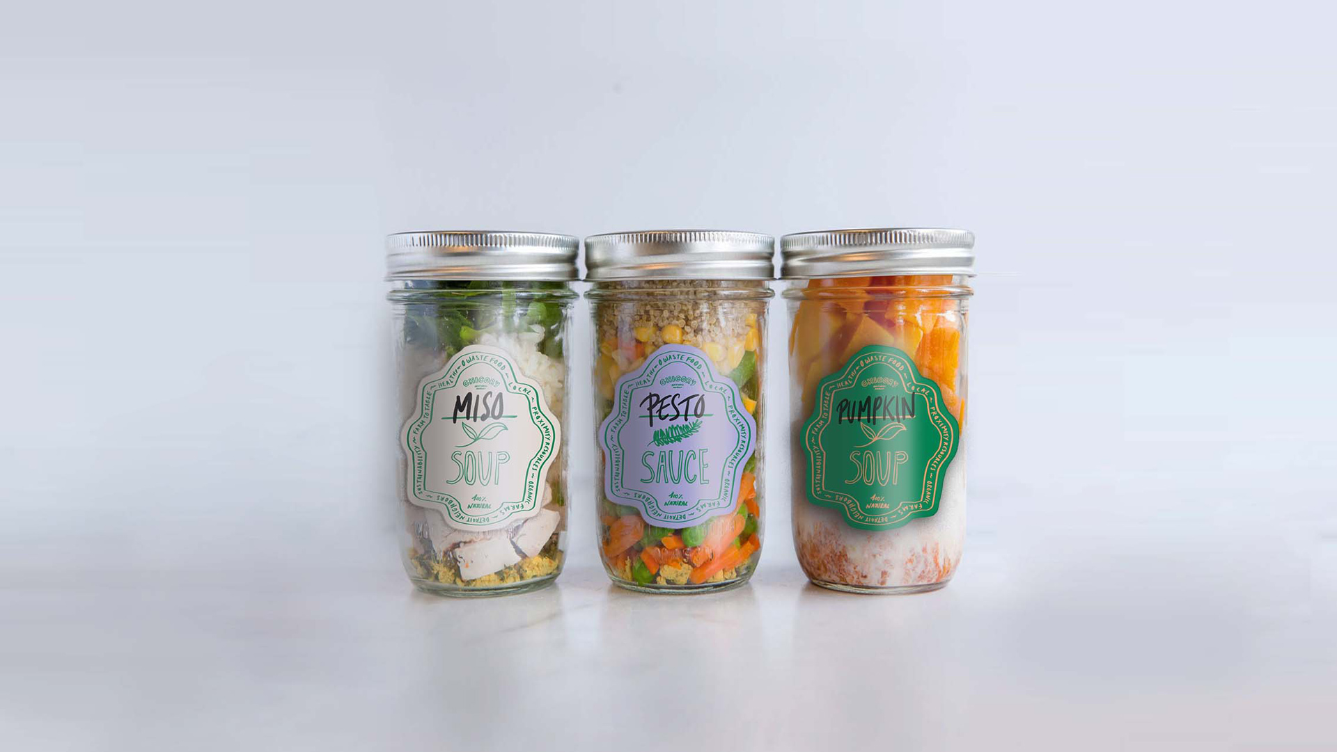
The typography of the brand actually became made by those who made “the made by hand” and based on that, we create a handicraft graphic universe that can help us to enrich the brand vision of a seasonal, proximity and organic market. And that should come to live in the illustrations and the packaging that were designed uncompleted so those who worked on the market finish the label with their own hands as a common element in many of their products.

